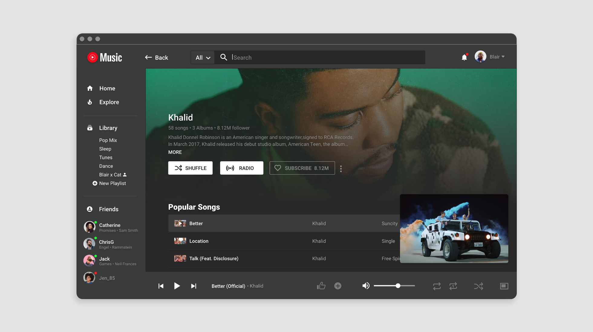
YOUTUBE MUSIC REDESIGN
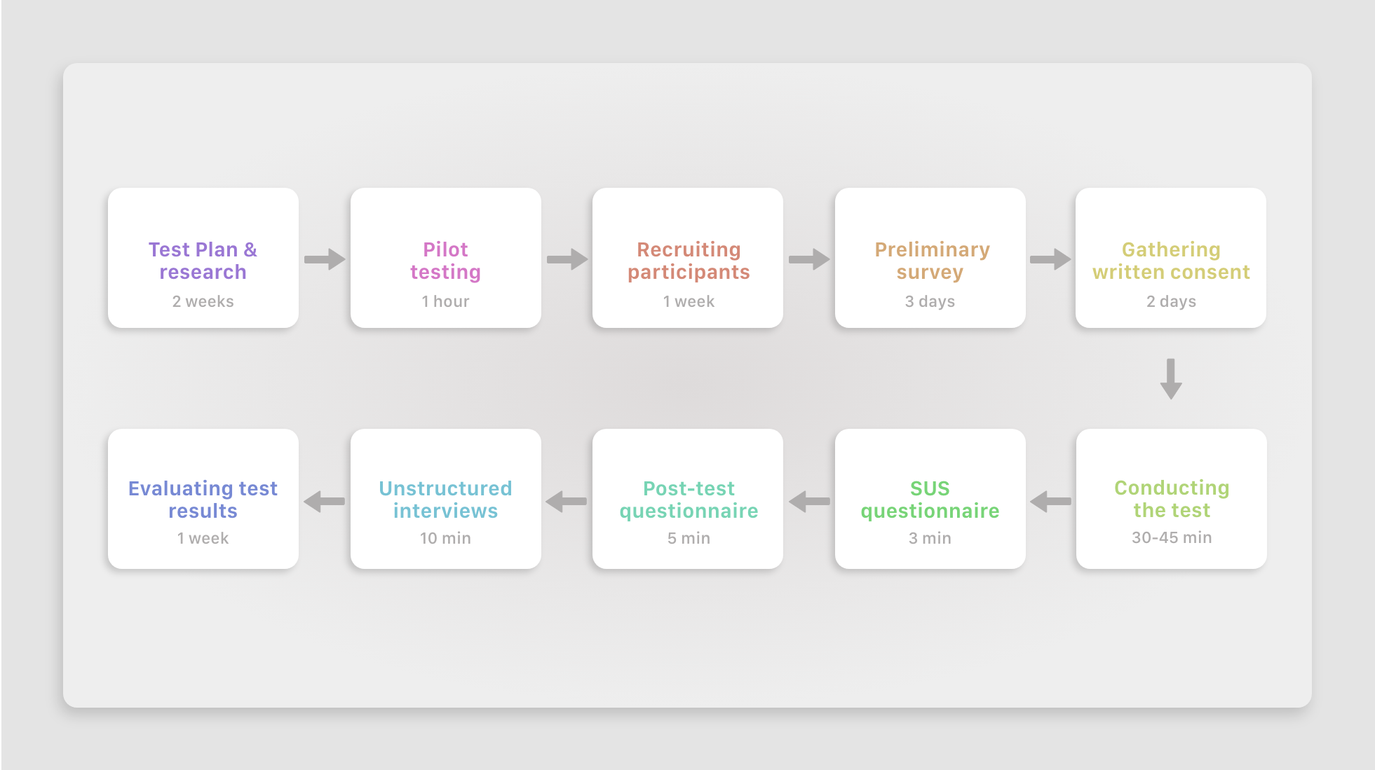
For a university project I conducted a remote usability test in line with CIF standards, comparing YouTube Music and its biggest competitor Spotify. The results were used to redesign the Youtube Music desktop app.
The problem
YouTube Music is a music streaming platform released in Nov 2015 by YouTube, a subsidiary of Google. What makes it special? In comparison to other music streaming providers (Yes, with others I mean Spotify), YouTube Music allows you to watch music videos, listen to unofficial remixes, covers, lyric videos or concert footage sourced from YouTube itself. So how comes none of my friends use it?
A great barrier for being successful on the market are the existing competitors. In order to get your piece of the music streaming-cake a seamless user experience is an absolute must-have. When I first discovered the YT Music desktop app, I was pretty underwhelmed by how it presented itself and discovered a bunch of UX issues that I address here.
Methodology
The testing method for this report complies with the Common Industry Format (CIF). You heard it many times: UX Design is all about making products more usable. But what exactly is “usable” and how can we define and measure a “soft” attribute that is not tangible? The 3 magic words are – efficiency, effectiveness and satisfaction which in turn can be measured through the following indicators.
Objective indicators: Directly observable, reliable and ideally unbiased
- Efficiency: Measured by time on task, error rate, assist rate
- Effectiveness: Measured by calculating the task success rate.
Subjective indicators: Judge how satisfied a user is with a system
- Satisfaction: measured through a “quick and dirty” post-test SUS rating questionnaire
Now we have variables that can be measured in numerical form and produce reliable quantitative and qualitative data. Better than relying on assumptions ! To find out how Spotify turned into the Mecca for all music streamers, a comparison test between system A (YouTube Music) and system B (Spotify) was chosen as a test framework.
Participants
To create a realistic test setting and produce representable data, the right participant screening is a key factor. I recruited 5 participants in line with typical demographics of music streamers. The chosen participants represent a 3:2 ratio of males to females, with a median age of 24, frequently streaming music in particular via Spotify and are comfortable in using tech, which I guess every Millennial is anyways.
Task Design
A total of 5 tasks were presented to the participants. Each task was introduced with a scenario and a maximum task duration and followed by a post-test questionnaire at the end of the session. The tasks itself, were modelled based on common activities like browsing music and creating playlists. Pilot testing showed there is a potential bias when letting them choose their own songs, that’s why I asked them to search for a specific song.
Results
Whit an average SUS rating of 49,5 which equals “Awful” the results speak for itself. Quote: “It just wasn’t a good experience at all and you’d just expect YouTube to be ahead of the game “. Agreed. When looking at what caused these low ratings, one can differentiate between issues in the following 3 areas:
Use scenario
YT Music lacks differentiation from YouTube itself
Users of the desktop app are busy doing other things like working. No one really sits down to watch one video after another, they just want some background music. Otherwise, why not just use good ol’ YouTube.com?
Videos= slows down the reaction speed of the app = long waiting times = frustration
Features and functionalities
The Miniplayer can’t be closed, yes you heard right. Fun fact: Users found this so annoying that there is actually a whole reddit thread about that specific issue
The overall wording of categories and buttons was misleading and vague
Lack of social features, those available are too hard to find (even for Millennials)
Why on earth are there two different setting menus? One on the home side and one hidden under “Profile”, both entailing important settings.
Design
Black UI with white text doesn’t pass any accessibility test, can cause eye strain and makes reading difficult
Big spaces in between elements force users to do a looot of vertical scrolling and therefor making it hard to scan the presented content
Central CTA’s are coloured red. Participants perceive it as a negative colour that indicates the made a mistake
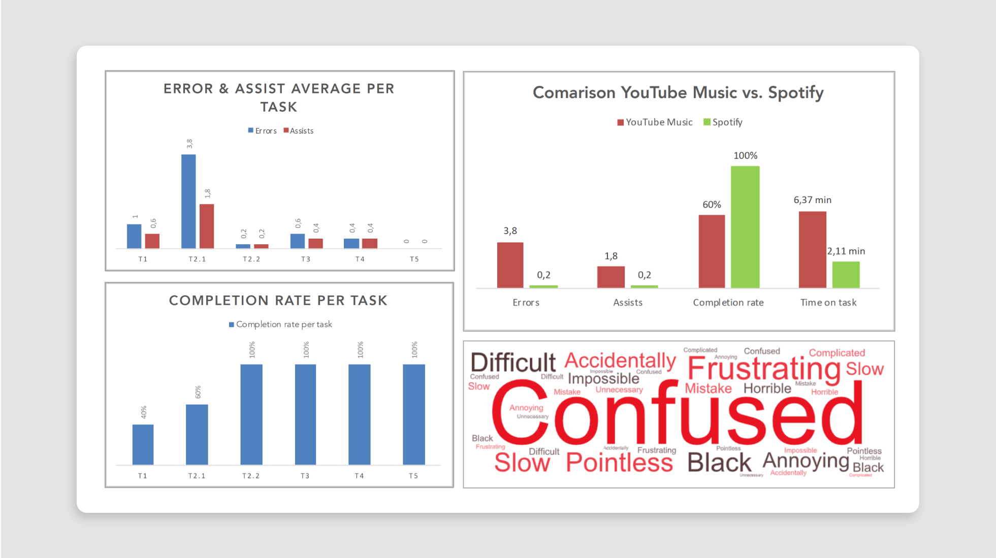
And now to the stats and figurers: As seen above, participants struggled to set the language and use the general features of YouTube Music. The difficulties become even more apparent, when compared to a similar task performed on Spotify. A word cloud with common phrases used in the interviews, shows the negative emotions of participants towards the system.
In addition to this, there is a NPS of -80, with 80% of participants falling into the group of detractors. Detractors are users that are unhappy with a product and system, unlikely to use it again and also discourage others from doing so.
Redesign suggestions
So how could YT Music do better? Here are some of my top suggestions:
Give users option to listen to songs without watching videos
Create one joint settings menu with all necessary settings
Rename categories/ create new categories, add inspirational graphics, restructure search window, enable search in subcategories
Remodel structure of song player view, integrate lyrics and replace repeat icon
Facebook integration, restructure process of creating collaborative playlist
Use different shades of grey instead of black and white for text to improve contrast/readability. Reduce spacing between elements. Replace red with different colour for CTA’s
User Research
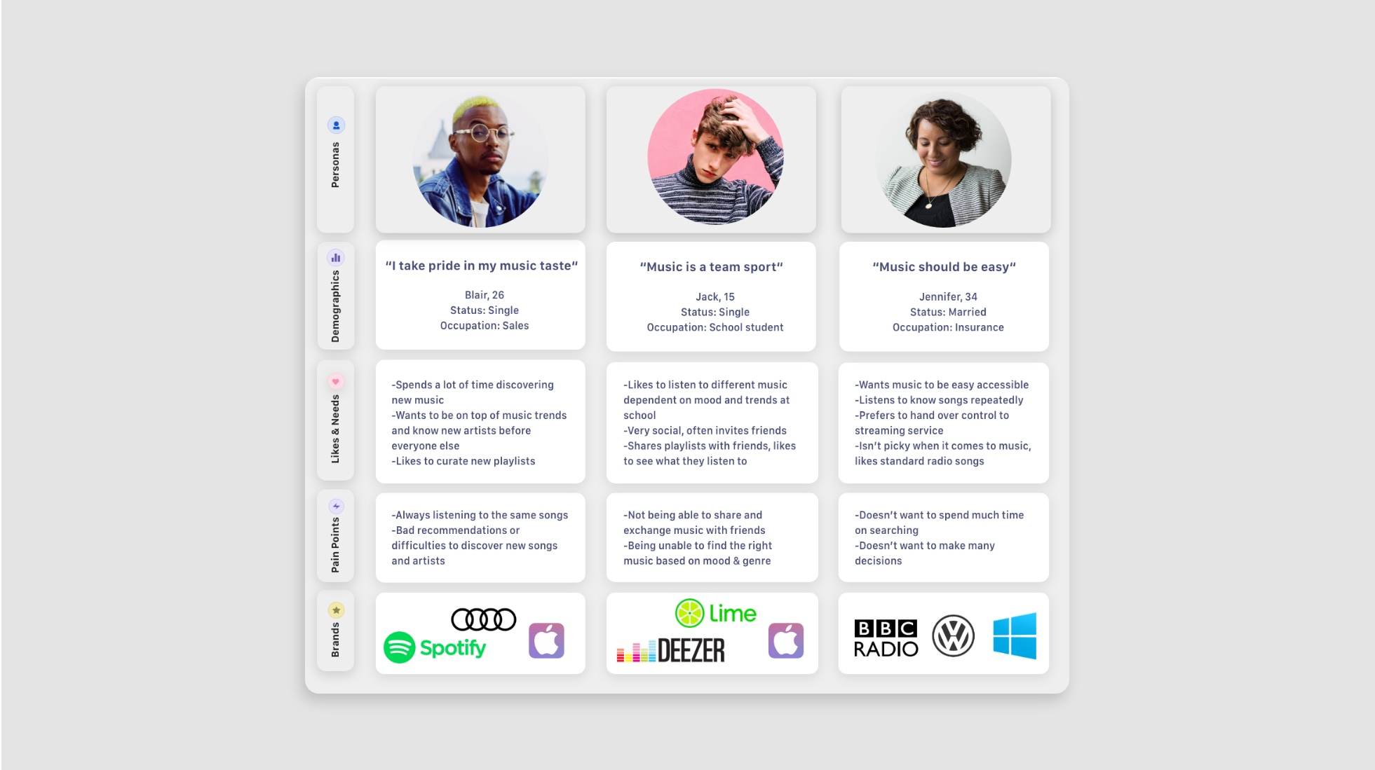
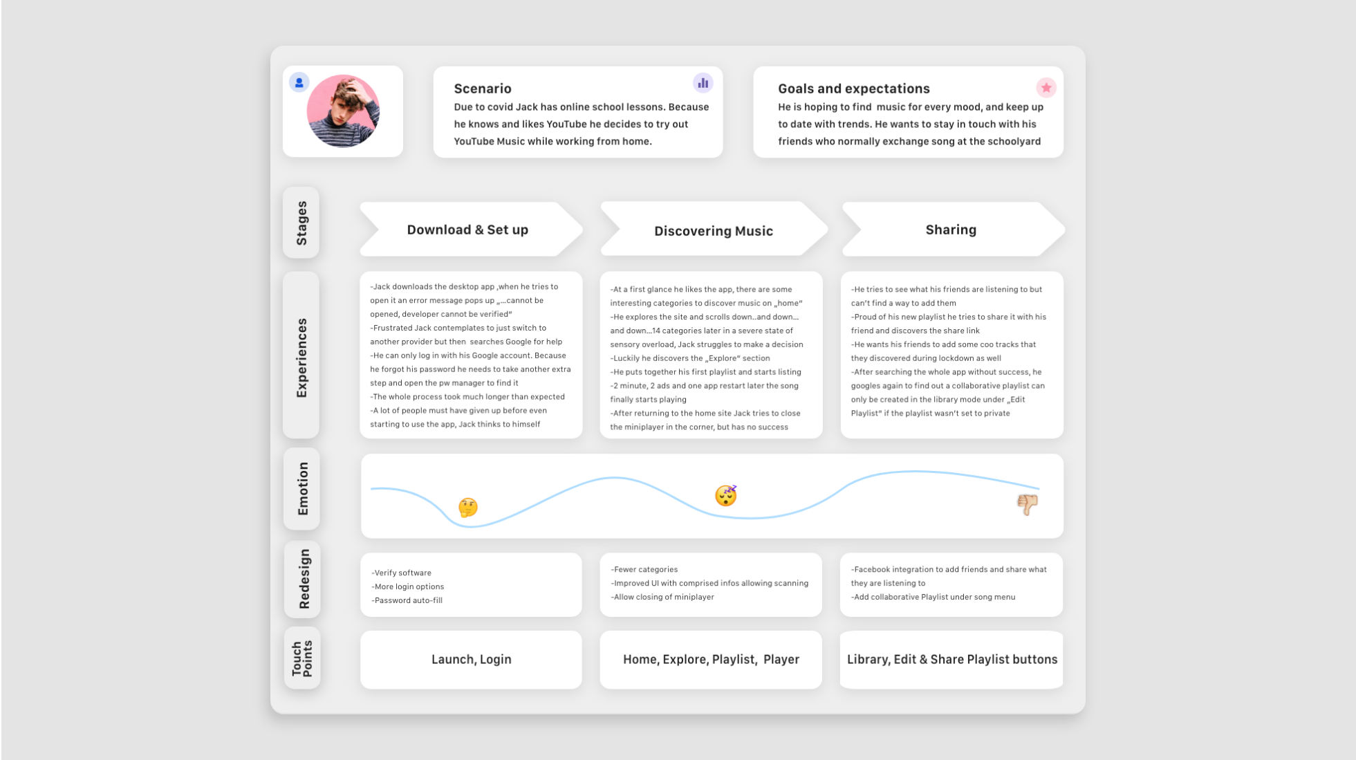
A typical user journey for one of the 3 personas was created, to portray the frustrations that users experience while interacting with the app and highlight opportunities for redesign.
Information architecture
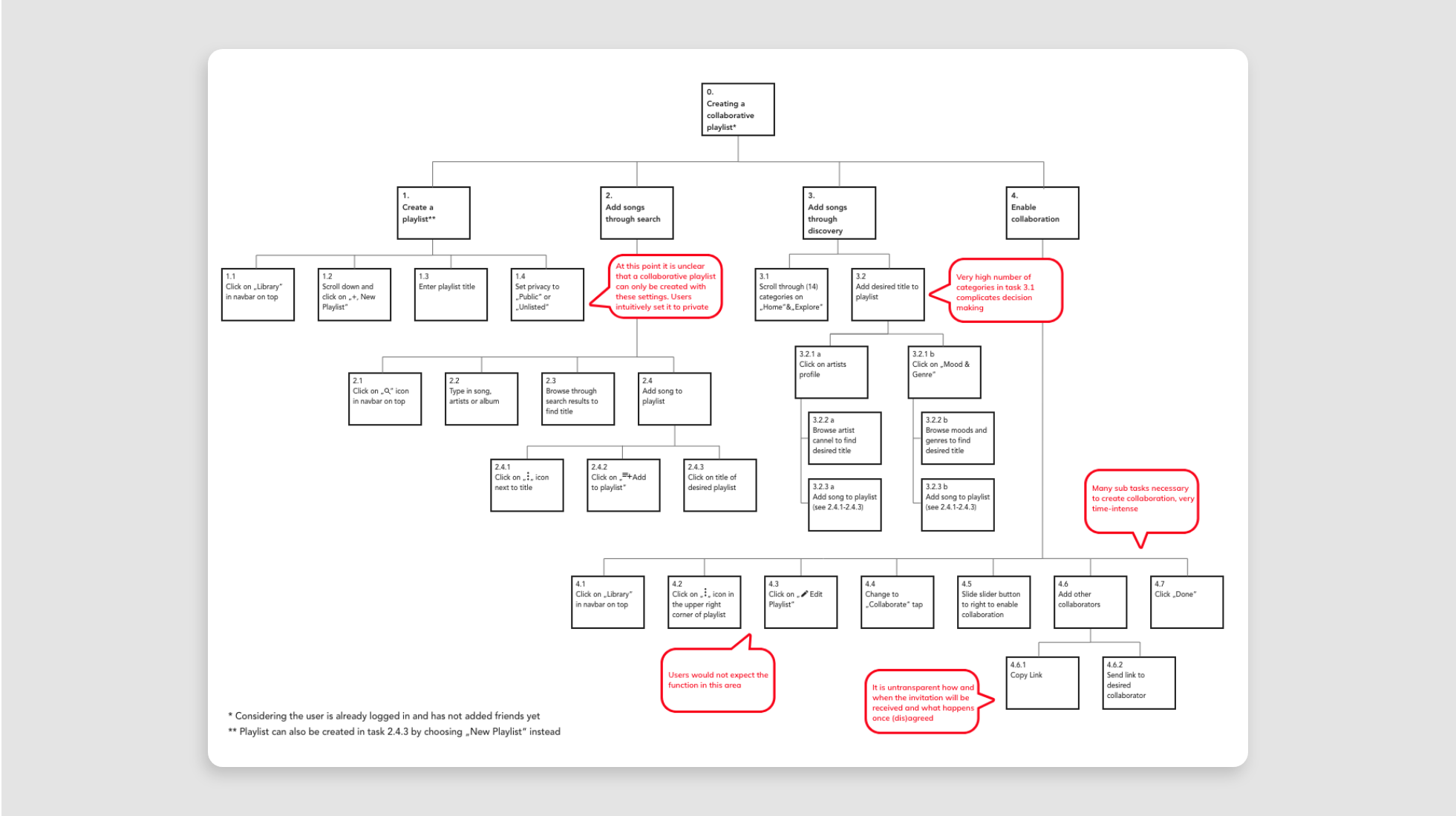
The following HTA shows the process of creating a collaborative playlist, which includes other subtasks like creating a playlist, searching and browsing for songs.
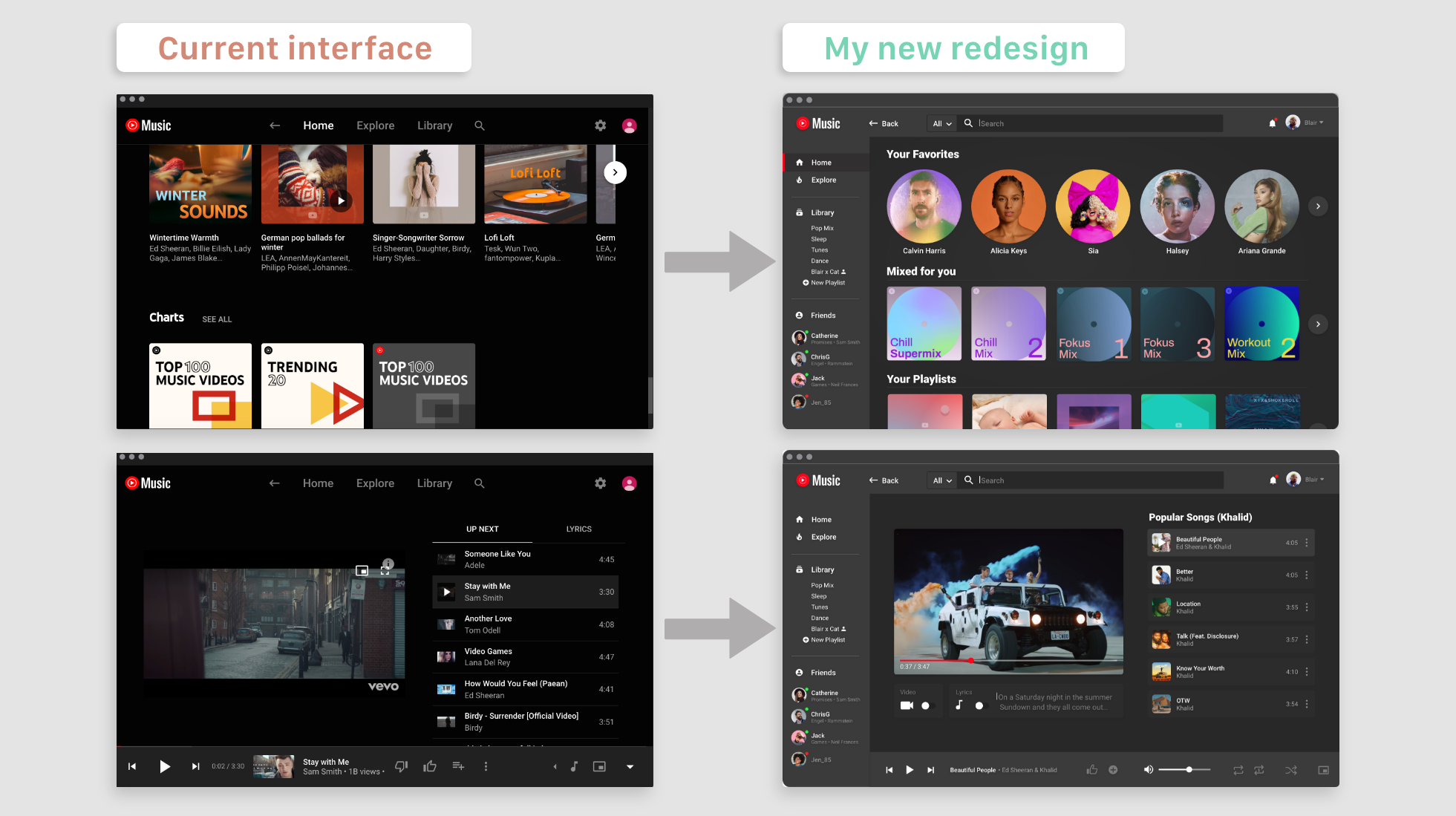
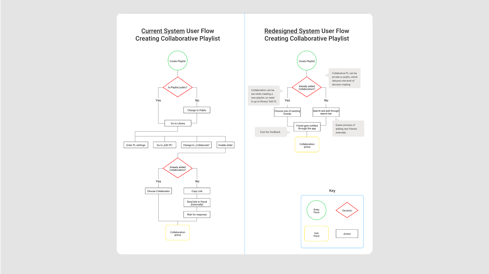
The old user flow on the left is long and not intuitive. The one on the right is my new, slimmer model.
Design System
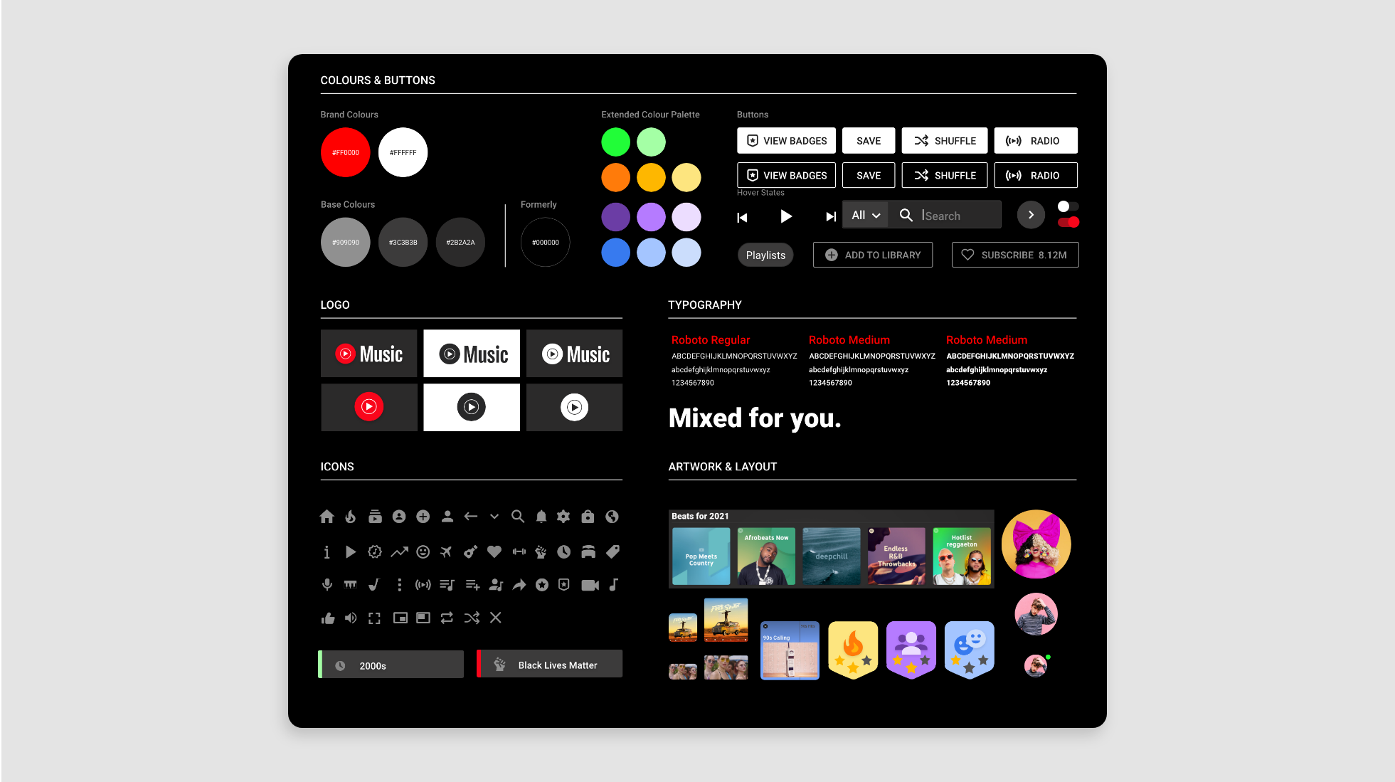
To define a set of general design principles different guidelines including Apples iOS Human Interface Guidelines, GNOME developer design principles and Gestalt principles were taken into consideration. VIP principles were: Consistency, clarity, progressive disclosure, visual hierarchy and alignment.
The redesign got rid of the red CTA’s that were perceived as negative and those contrasts abusing your eyes and uses white and light grey colours on grey backgrounds. Inspired by the existing desktop app Roboto was chosen as a system font, allowing a natural reading rhythm.
On a social level the redesign aims to counteract discrimination and racism. Social movements like the Black Lives Matter movement or LGBT+ rights were addressed through matching categories. The redesign follows the UK Gov Accessibility in Design guidelines .
Prototyping
Based on the low-fidelity version, a mid-fidelity prototype was created to display the compatibility of colours and define key icons and font spacing.
And here we have the end result, ready to steal Spotify-users…
Conclusion & Learnings
I learned that those tasks designed to fail, should not be placed at the beginning of the test. Participants easily get frustrated, which also affects the way the approach the following tasks.
The tests have shown that one of the key weaknesses of the app is the core idea behind it. Oh, I forgot to mention that you can’t actually download the app without a few tricks, because it isn’t verified. This and other factors, are severe problems that cannot be solved with UX and need reconsideration on a business model level.
The final prototype however, managed to fulfil the needs of all 3 personas. Blair is able to intuitively discover new music through the explore feature. Jack is now able to see what his friends at school are listening to and can create collaborative playlist much quicker. Through the lucid side navigation bar, Jennifer can access her music much easier, the compact layout allows her to scan content faster and thus also speeds up the decision-making process.


