HUBTEL - DIGITALISING HOTEL SERVICES
A 6-month project about tech in the hotel industry, including UX Design and UX Research. Hubtel is a system for in-room tablets, aiming to digitalise the hotel experience, improve guest satisfaction and revenue.
Background
As a keen traveller and employee in two lodges in NZ during my work and travel year, I have been on the receiving ends of both sides of the hotel industry. I remember my manager implementing in-room tablets and creating the interface in power point (by one of the gardeners, no joke). Back then I wasn’t fully skilled in UX design, but I knew I had to do something about it. So now -two years later- I came up with Hubtel.
Corona hit the tourism industry hard, with expected losses over 2.1 trillion $. To level out the losses made, it is important to stay competitive once the world regains permission to travel again. Two major trends are personalisation and digitalisation. The in-room tablet introduces both, while supporting social distancing.
The services that can be offered through this interface are countless: From reception requests, F&B orders to spa or tour bookings. The central factor which decides whether the use of this technology will be a success, or a failure is the user experience. With this project I am aiming to explore the needs of both stakeholders – hoteliers and guest – to design a system that offers new and more innovative features while being intuitive to use.
User Research
Quantitative research
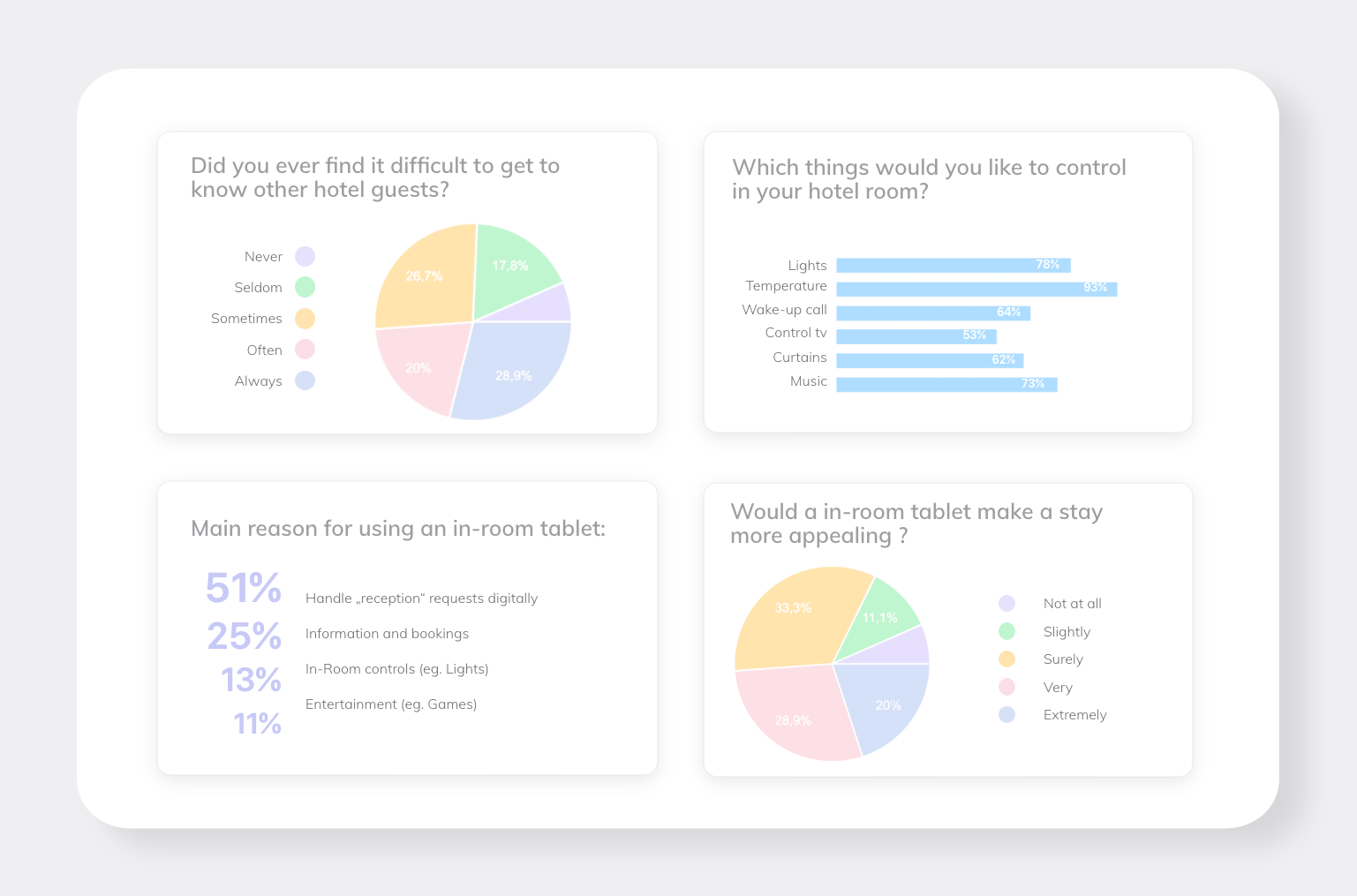
A survey with 45 participants of different demographics (age, travel type, tech-savviness etc.) was created to distinguish user needs and pain points
Qualitative research
In addition to this I conducted 9 semi-structures interviews with typical hotel guests and 3 hotel managers to back up the findings from my survey and put them into context.
Common frustrations included:
Hotel staff can’t be found
HK staff coming in unexpected
Guest didn’t know how to handle room controls
Misunderstandings due to language barriers
Long walking distance to reception
Non-transparent fees upon checkout
Connecting the dots
With the knowledge about typical problems, I went on to define HMW questions.
There is a remarkable range of different hotel types and guest types with individual needs. Because it is difficult to satisfy this variety of demands with one interface design, I decided to narrow down my target group to boutique hotels (did some extra research on that).
Characteristics of the mysterious and often misused term “boutique” are:
40-150 rooms
Smaller number of staff
Modern, design-led
Typical guests: 20-50, mid to upper average income
In addition to that I considered a study by PwC, stating that these types of guests actively avoid mainstream in favour of personalisation; a definition of traveller “Tribes” developed by sociologists and marketers; and a traveller classification by InterContinental.
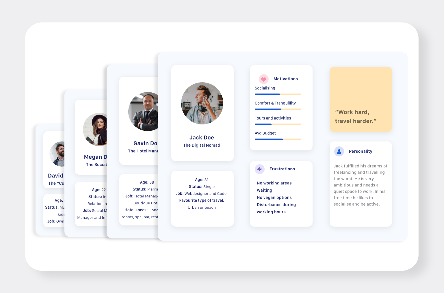
The findings helped me to define my 4 core personas:
The “boutique” hotel manager
The digital nomad
The sociable millennial
The curious midlifer
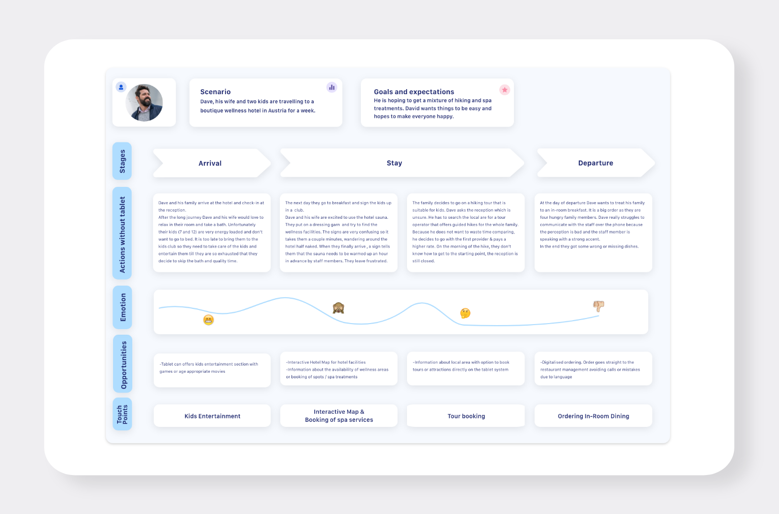
Empathy maps and user journeys for all Personas were created and split up into the 3 stages: pre-arrival, stay and post-departure. This was to identify further touchpoints and frustrations.
All my previous findings were collected in an affinity map to get an overview over the issues I want to tackle.
And then it was time to find solutions for my problems, the actual list was long but here are the key points
Information architecture
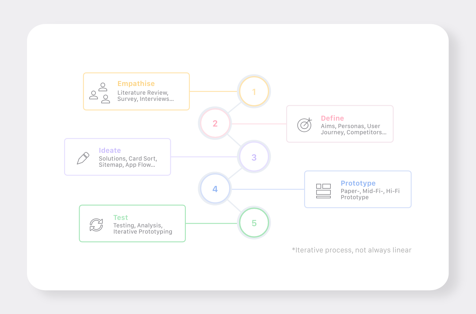
Before going into the prototype stage, I defined the framework of my system. A card-sort helped me to identify intuitive categories, which were then structured in a site map. A user flow was created to check if that structure is logical and usable.
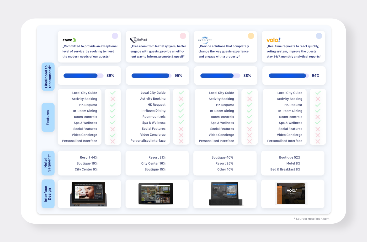
A look at the main competitors gave me inspiration to create more useful features and a modern design.
Prototyping
Eventually, I was able to prototype. I started off with a simple paper prototype to define the overall layout of my interface. A mid-fidelity type showed my ideas in a bit more detail and was tested before going into the more time intense high-fidelity prototype. I tried to consider the principles of accessibility in my design. In order to support visually impaired people, I used a plug-in called Stark that can run a colour-blind simulation. In addition to that, I made sure to use characters with a variety of ethnical backgrounds.
Testing
I conducted a remote one-shot usability test with 5 participants oriented to CIF guidelines measuring completion rate & time, errors & assists and also evaluated satisfaction rate with a quick questionnaire. Results were collected for each area of the prototype and led to an iteration of the hi-fi prototype.
The end result
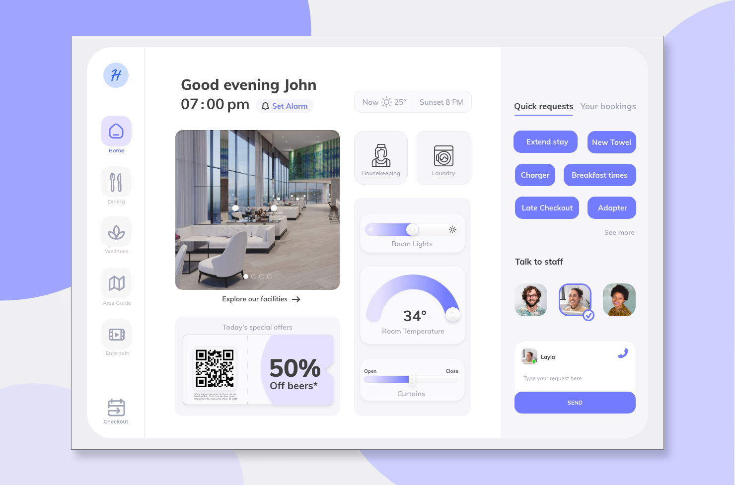
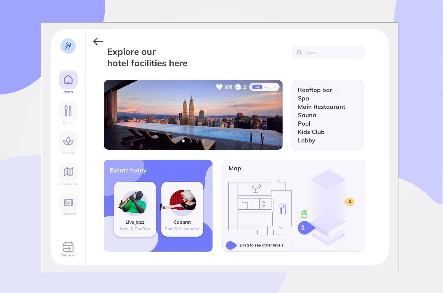
And this is the end result: One main system that identifies the guest type through an onboarding process and offers a specific interface for the needs of that type including a simplified communication section, dynamic vouchers, housekeeping orders, food orders, spa and tour booking, live information about hotel amenities and many more features.
Research has shown that there are different guest types with different needs and pain points. That’s why there is a 3-step onboarding process that allows the system to allocate a guest to a pre-defined category (Personas) and display an interface that is tailored to this specific user group.
Throughout the entire prototype, I added new features that are inspired by social media platforms and therefore familiar to the users. Hotel facilities can be liked and commented to give more realistic insights to guests and managers.
The Feedback survey uses smiley icons, and there are live occupancy tags across the system that are inspired by google. These features provide the user with key information that they need to make decisions and avoid frustrations.
Food or taxi ordering systems are inspired by best-practices to make sure the user does not need to “relearn” a whole new ordering concept.
Lastly, one of my research findings suggested that solo travellers want to socialize but find it hard to make contact in big, anonymous hotels which have a very different atmosphere compared to backpacker hostels. That is why I developed a new social feature which lets hotel guest find other guest for joint activities.
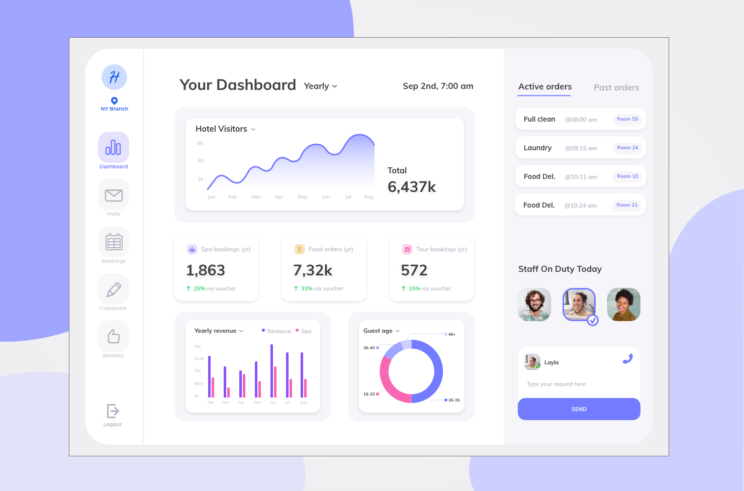
A second interface gives the hotel managers insights into KPI’s and control to adjust, content, marketing offers and colour scheme according to their business needs.
Conclusion & learnings
Covid made some aspects of the project a bit more challenging since user research and testing had to be conducted remotely. Another difficulty was to find hotel managers for my primary research. A lot of people working in hospitality were
massively affected by the pandemic, lost their jobs or weren’t open to share insights.
I thought about the minibar feature upon check-out and would probably get rid of it because not every guest can be trusted to tick the right boxes, tough it’s a cool feature it isn’t usable and an invoice would be the safer bet.
