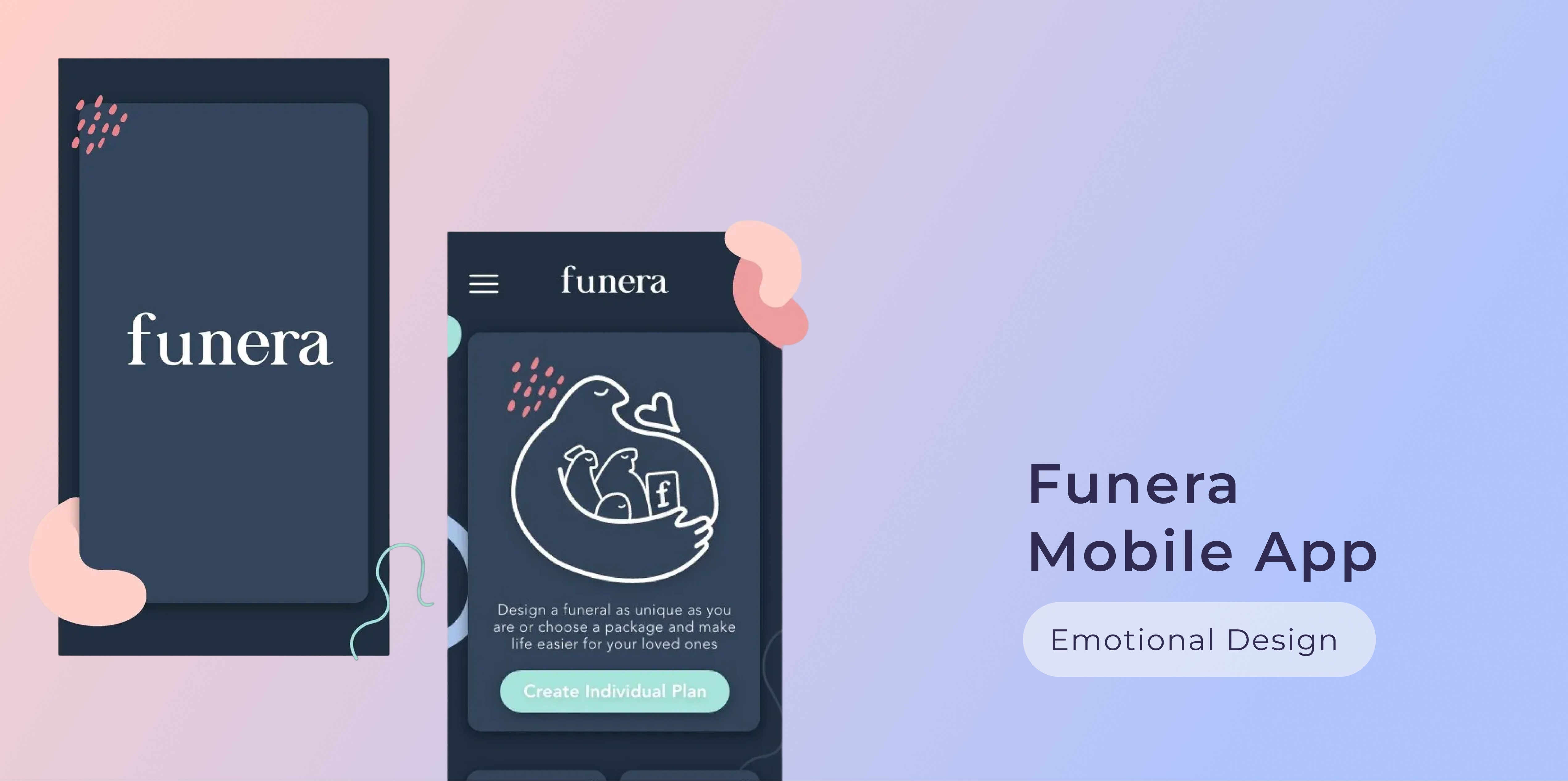
Funera / App Design

Funera / App Design

Funeral Planning App

Funeral Planning App

Innovating the death-care industry

Innovating the death-care industry

UX/UI Design

Product Design

Mobile Design

UX Writing

B2C

Overview

Client: University Project

Industry: Death-care

Role:UX&UI Designer

Duration: ~2 months

Project Intro

An 9 weeks uni project in the field of Emotional Design, UX Design and UX Research. Funera is a mobile app for funeral planning aiming to innovate the death care industry and make the topic of death more approachable.

Digital Influx is an ed-tech start-up dedicated to inspire the future generation to create a better world by cultivating critical thinking and creativity. Their core mission is to teach children the importance of essential values like empathy, diversity and inclusion for when its their turn to shape the future of human-computer interaction.

As an in-house UX-Writer & Designer the challenge was to create an interactive "UX for kids" course that is playful and stimulating for children, yet embedded into an educational framework.

_______________

The challenge

When it comes to death and dying there is a big cloud of fear, misperceptions and the nagging feeling of: this is how it’s always been done, it’s too risky to challenge that. Not to mention that the death-care industry seems to be completely untouched by innovation.


I asked myself: how can I as a UX Designer contribute to relief negative emotions by using technology in an innovative way? Obviously no app in the world can or should take away the sadness, but what it can do is giving space to grief without having to worry about other things on top of that.

The design-thinking process helped me to tackle the difficult topic of “rebranding death”.

_______________

Survey, interviews and market research

_______________

Survey, interviews and
market research

_______________

Survey, interviews and market research

In order to challenge my assumptions and to identify user needs, I conducted a survey with 30 participants aged 22-60 to explore a variety of opinions. I also interviewed 5 individuals to find out about pain points.

Key take-aways

Information has to be made more accessible. There is a need for a central platform guiding users through the planning process and at the same time informing about personalised options and innovative methods.

  • The industry is lacking innovation. An online approach can help to make the planning process faster, easier and more accessible.

  • There are social and cognitive issues complicating the planning process for individuals who have to plan someone else’s funeral (e.g impact of grief on cognitive planning skills). Pre-planning ones one funeral can be seen as the most advantageous method.

  • Green funerals are a key trend.

  • The main pain-point for pre-planning one’s own funeral is fear, because of the way it is perceived: dark, frightening, complicated.


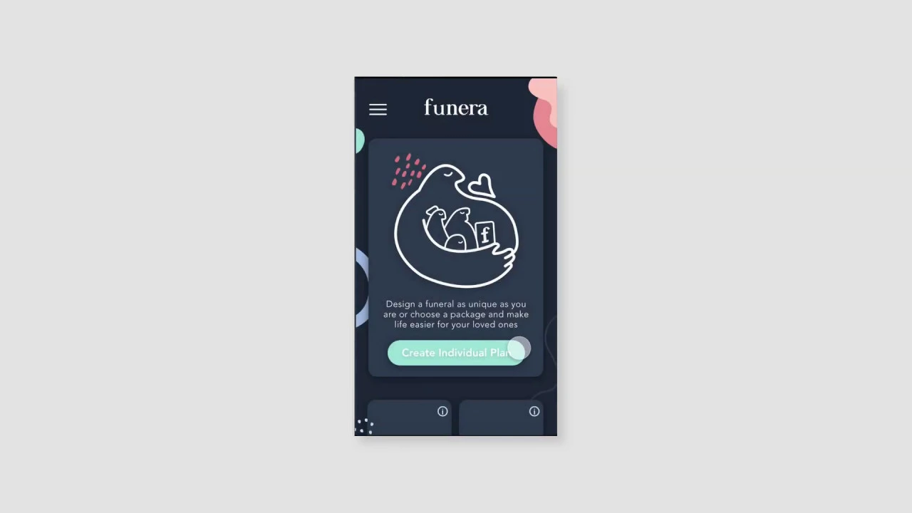
Based on these findings I formulated my aim: Make the topic of death more approachable for our generation, relief them from anxieties and the darkness surrounding the topic. And the objective: Developing an app to pre-plan your own funeral within an easy, joyful and more personalised experience.
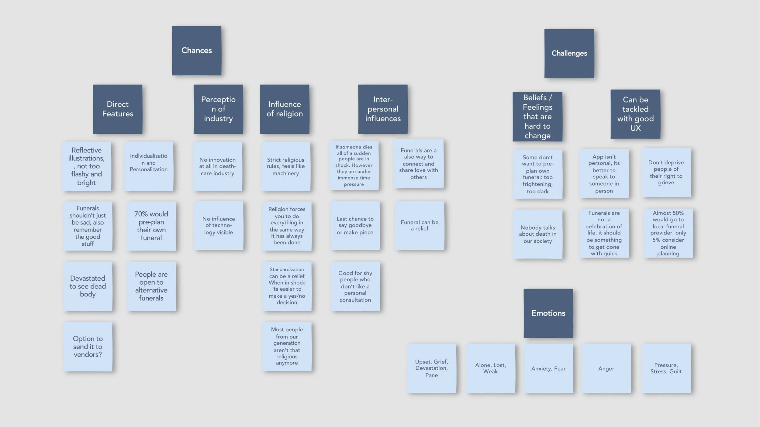
Affinity mapping

In order to ensure that all the facts and opinions gathered will have their impact on my design choices, I created an affinity map. It helped me to get an overview and also to structure thoughts into categories.

Defining my user group
To personify my typical app-user, I synthesised my research findings to create 3 personas, one for each main use case. To look deeper into their thinking patterns and emotions I also created an empathy map (download full report to see it).

In general, I want to address the generation aged 18-50. This is because younger people probably lack matureness and interest in the topic. On the other hand, older people are mostly very connected to traditional funerals and there is no need for change. Also, can you picture your 90-year-old grandma planning her funeral on an smartphone-app …me neither.
I further identified two main categories of user groups:

1)    People who are not threatened by death yet, because:
a)     They simply want to relief their family from a difficult planning-process.
b)    They are interested in alternative, very personalised or green funerals. 

2)    People who are facing death, because:
a)     They are looking for an easier, faster and less threatening way of planning.
b)    They want to maintain their autonomy and integrity when physically impaired.

Translate needs into features
In the next stage, I conveyed my key findings into suitable solutions. To gain an overview over the features that my app needs to accommodate on each level of emotional design (visceral, behavioural and reflective, more details in full report), I created this table.
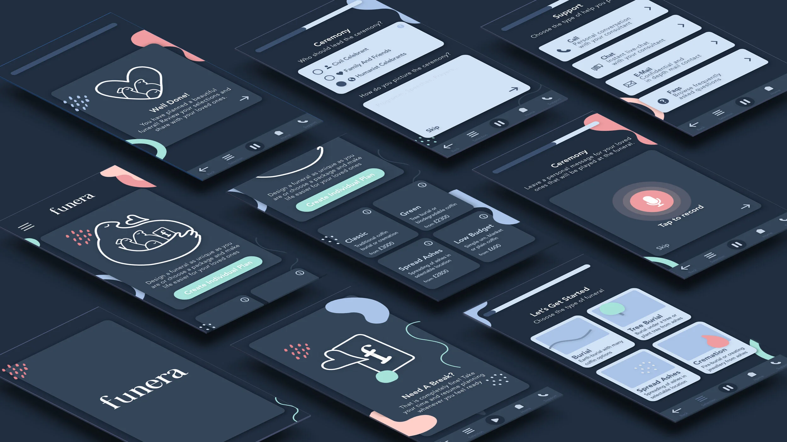
App flow
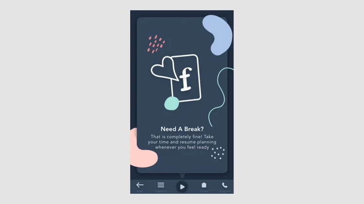
As a final step before prototyping, I thought about the information hierarchy of my app by creating an app flow. Through online research I incorporated all necessary steps for funeral planning and added valuable extras (e.g. personal recording) to create an USP for my app.

_______________

Wireframing

_______________

Wireframing

_______________

Wireframing

Based on a paper prototype I developed interactive and clickable wireframes in sketch to create a more realistic impression of my app.
I tested these wireframes with an in-person qualitative user test to understand the user reactions, frustrations and the general usability.


_______________

Applying principles of emotional design

_______________

Applying principles of
emotional design


_______________

Applying principles of emotional design

The tone-of voice

My decision-making process was influenced by the idea of a hierarchy of user needs which emphasises the importance of functionality over “just looking nice”.

The tone of voice I am intending to create is: supportive, safe, understood, soothing, welcoming, modern and smart.
“Funera” can easily be associated with the word funeral but has a more futuristic/positive sound to it.

In the product catalog section I decided to give the products a human name. This should again create a feeling of familiarity and prevent anxiety.

Thirdly, I created lesson plans for each lesson. This document informed teachers about the learning objectives, vocabulary, homework etc. and gives a short overview over the lesson. The difference to the teacher’s notes is that there are no in-depth explanations.

Colours and illustrations

In terms of my colour scheme I decided to use a darker layout with different shades of grey and blue as these colours portray security, stability and solemnity and therefore seem more suitable for my topic than a bright white background.

To avoid the feeling of dullness or heaviness, I chose coloured design elements all shaped in organic free-flowing forms.

I created my illustrations inspired by Anna Charity and the redesign of Farewill. I scribbled a friendly giant who holds your loved ones in his big arms. It suggests that they are in a safe, supported space.

Thirdly, I created lesson plans for each lesson. This document informed teachers about the learning objectives, vocabulary, homework etc. and gives a short overview over the lesson. The difference to the teacher’s notes is that there are no in-depth explanations.

Layout and hierarchy

The general hierarchy of elements is based on the Guttenberg diagram with our eyes following a typical pattern.

According to Hick’s Law the number of alternatives presented increases similar to the time to make a decision. One of my main goals was to make planning easier and faster. That is why I decided to offer only 4 packages, matching the needs of my different user groups.

A progress indicator was implemented because according to the Goal Gradient Effect, motivation to complete a task rises knowing you are close to complete it.

Thirdly, I created lesson plans for each lesson. This document informed teachers about the learning objectives, vocabulary, homework etc. and gives a short overview over the lesson. The difference to the teacher’s notes is that there are no in-depth explanations.

_______________

My solution/final product

My solution/final product

_______________

Learnings

I am curious about how this app could be implemented into reality and how the business model behind it would be build up (platform or one provider). I constrained my research to a certain degree due to the scope of this project, but there are several other approaches I could imagine being an insightful extension (e.g. how to implement best practices and psychology-theories from the field of online shopping without being insensitive, how to implement a chatbot).

I found it very important to learn about emotional design and its tools as it is a universal and pervasive topic that affects UX designer regardless of the project they work on.

*Looking back at this uni project after many years in the industry I smile at how I thought this flow could be applied as simply into the real world. However I still think the emotional design and mobile aspect are still valid. It might also give you an idea how my Ui design skills and professionalism grew from here :)

_______________

Learnings

I am curious about how this app could be implemented into reality and how the business model behind it would be build up (platform or one provider). I constrained my research to a certain degree due to the scope of this project, but there are several other approaches I could imagine being an insightful extension (e.g. how to implement best practices and psychology-theories from the field of online shopping without being insensitive, how to implement a chatbot).

I found it very important to learn about emotional design and its tools as it is a universal and pervasive topic that affects UX designer regardless of what the project they work on.

*Looking back at this uni project after many years in the industry I smile at how I thought this flow could be applied as simply into the real world. However I still think the emotional design and mobile aspect are still valid. It might also give you an idea how my Ui design skills and professionalism grew from here :)

_______________

My solution/final product

_______________

Learnings

I am curious about how this app could be implemented into reality and how the business model behind it would be build up (platform or one provider). I constrained my research to a certain degree due to the scope of this project, but there are several other approaches I could imagine being an insightful extension (e.g. how to implement best practices and psychology-theories from the field of online shopping without being insensitive, how to implement a chatbot).

I found it very important to learn about emotional design and its tools as it is a universal and pervasive topic that affects UX designer regardless of the project they work on.

*Looking back at this uni project after many years in the industry I smile at how I thought this flow could be applied as simply into the real world. However I still think the emotional design and mobile aspect are still valid. It might also give you an idea how my Ui design skills and professionalism grew from here :)

Digital Influx / Ed-Tech

UX for kids course

Product management, User research, UX Design, UI Design

UX/UI Design

Product Design

UX Writing

B2C