BRAND STORE FOR CHRIST.DE
A three month project in the field of fashion and e-commerce. Working between CHRIST’s marketplace and UX department, my job was to build private label brand stores for Amazon and Zalando. Besides UX design, this project included features of product management and marketing.
PROJECT BACKGROUND
CHRIST is the German market leader in jewellery and watches in the mid-to-upper price segment. I’d describe the brand CHRIST as quite traditional and well known amongst Germans. Don’t be surprised if you haven’t heard about it in the UK, it hasn’t made its way over the pond yet.
Today the biggest challenge for the company is to build bridges between their strong focus on stationary stores and their fast-growing e-commerce platform.
With a mixture of private labels for different target groups and its multi-channel strategy, the company tries to secure its position on the market. Part of this strategy is the distribution of private labels on different platforms like Amazon and Zalando. So, take a look at what I worked on…
THE DESIGN PROCESS
BRAND ATTRIBUTES & MISSION STATEMENT
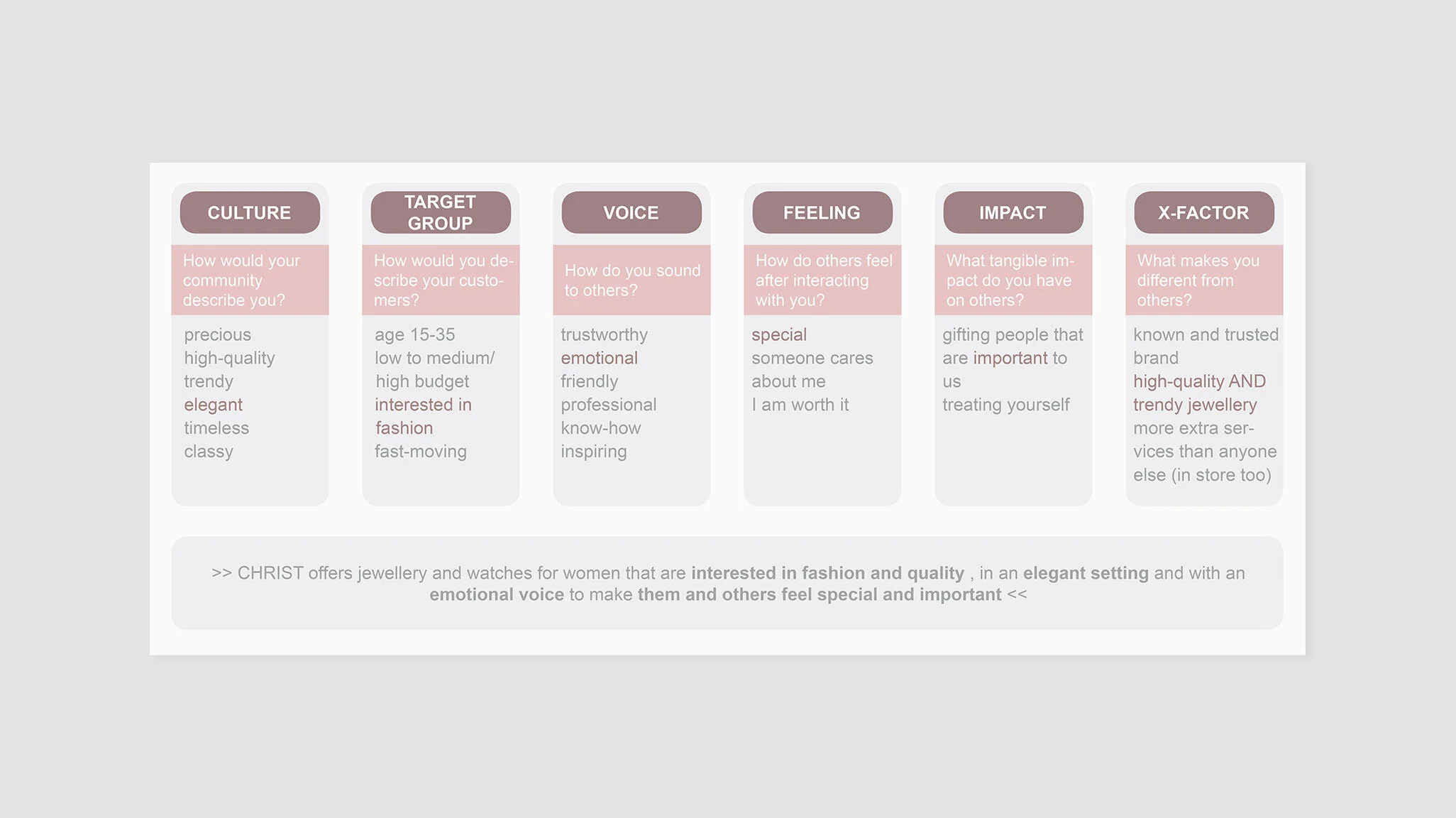
I started the project with a short kick-off workshop, to understand the core brand message that CHRIST wants to communicate on these new platforms. We began by gathering everyone’s expectations and brainstorming attributes for 6 different categories.
Afterwards we highlighted the key attributes and used those to formulate the brand mission in one sentence.
PERSONAS
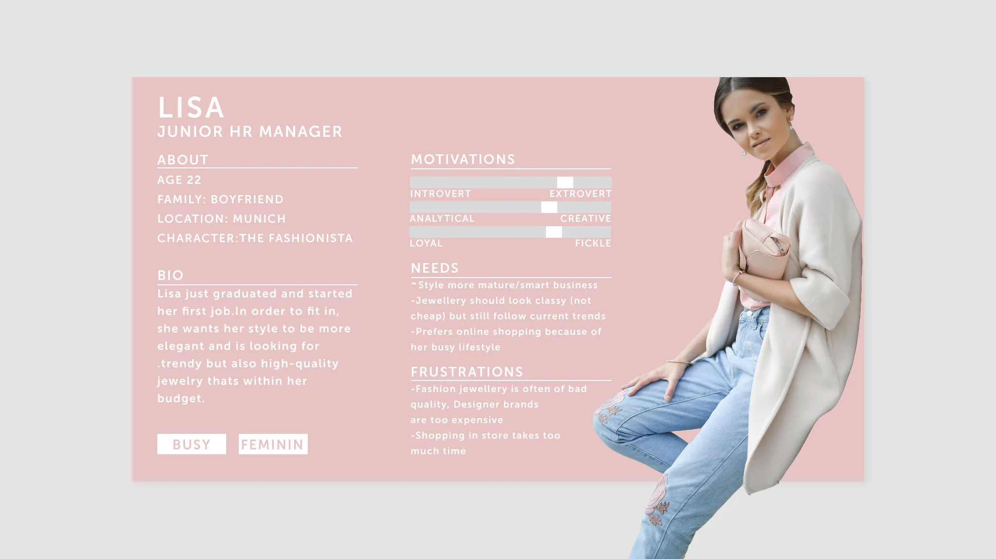
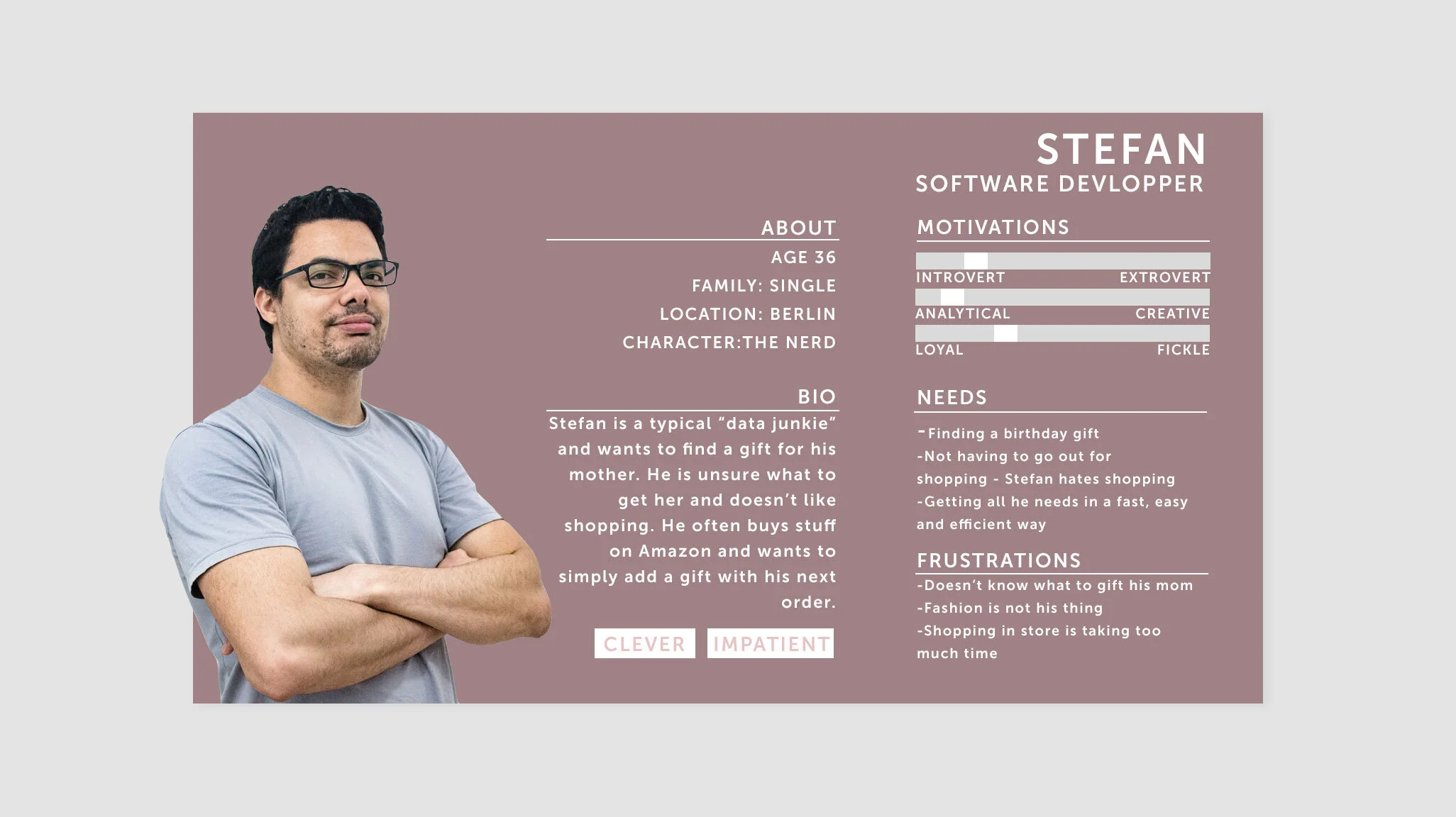
Based on the input from our workshop, I then tried to create two typical personas to dive into their background, goals, needs, motivations and frustrations.
PRODUCTS
With a better understanding of the target group and the brand attributes that should be communicated, I could now think about which products would sell best on the two platforms.
Based on internal sales data from the last years, I found that the typical Zalando buyer is more likely to be female and looking for trendy and affordable jewellery for herself. Thus, the main focus was on the C-collection and Jette which are private labels that offer fashionable items for a smaller budget. As an addition, the best-sellers of CHRIST’s Gold and Diamonds collection (higher price range) were chosen, focusing on timeless designs and everyday basics.
On Amazon, CHRIST displays a much bigger product portfolio and attracts a wider field of people with different budgets. It is for example very popular amongst men who are searching for gifts or people looking for engagement rings. The age of buyers also tends to be wider spread , starting from a young age to people in their 60’s. Thus, CHRIST should include all of its private labels on Amazon, to offer different kind of styles in different price segments.
INFORMATION ARCHITECTURE
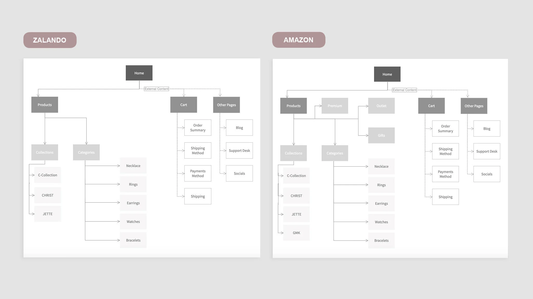
Brand shops are integrated in the actual platform shop and therefore just require navigation through product categories. There was no impact on filter methods and the information architecture for this project was rather limited. I visualised the chosen categories in a sitemap.
BUILDING THE SHOP STRUCTURE
With low-fidelity wireframes I could easily design the general structure of the shop with a trial and error method. Without much effort adjustments could be made, before going into the much more time-consuming digital implementation.
FINDING A VISUAL STYLE
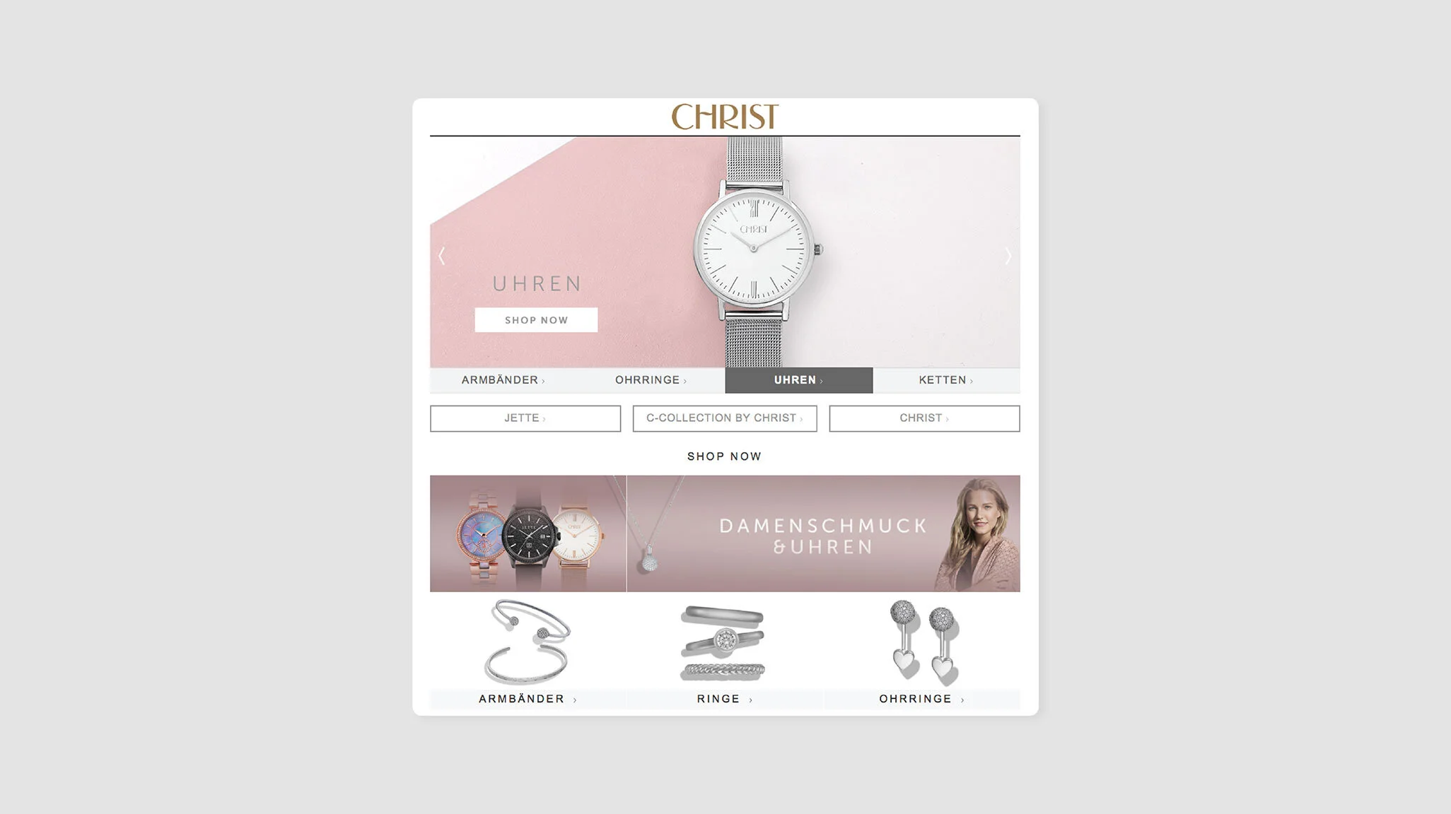
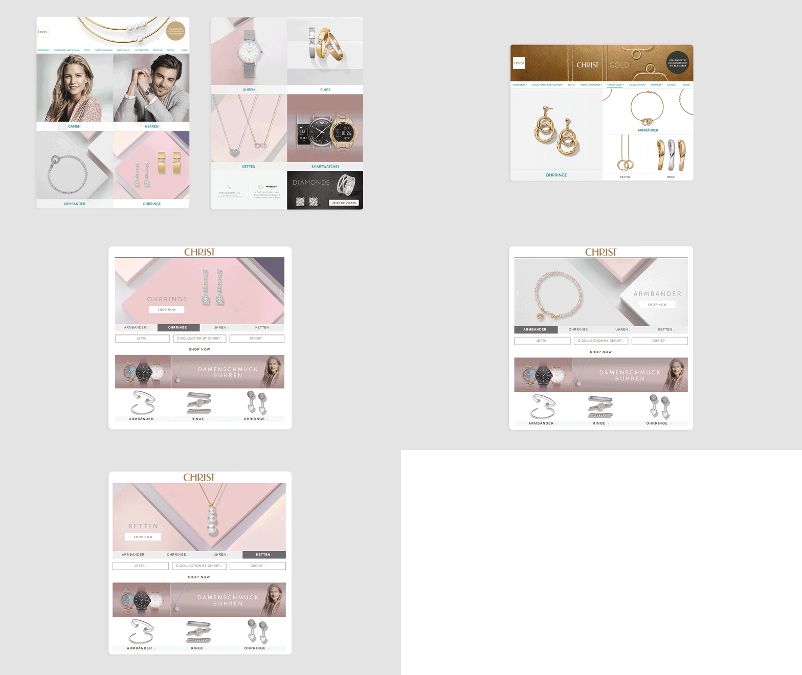
For the final step I took the mission statement and the different target groups into account to develop designs. Of course I also had to respect the companies CI and use the oblige fonts, highlight products and model shots. Colours, textures and the chosen jewellery pieces were in the centre of my design. All graphics displayed were created by me in Photoshop.
CONCLUSION & LEARNINGS
I really enjoyed working on this project and was very happy about the opportunity and responsibility that was given to me. I worked within a very supportive team.
Looking back at it now, I would design the Amazon store a little “slimmer”.
An important learning is, that not every user likes to click through several categories in order to get to a product. Well, actually no one does. Sometimes they don’t even know whether they want a necklace or earrings and simply want to get inspired.
By making them choose a certain brand or product type, it forces them to go back to the main menu and click through another category over and over again which is without a doubt super annoying. Thus, there always has to be an “all products” category visible.
It would have been advantageous to conduct a usability test to avoid these mistakes, next time I will make sure there is one!
